

Facebook’s New Page Layout
If you spend time each day using your business Facebook page, then you’ve probably noticed Facebook’s new page layout. If not, then you should know that Facebook Pages now have a new look that seems a bit more organized and structured for better future growth.
While the new design feels a little cold and utilitarian, I’m sure that was completely on purpose. Since Facebook is pay-to-play for businesses, it makes total sense that they make the layout more practical.
Our Facebook page header used to look like this:
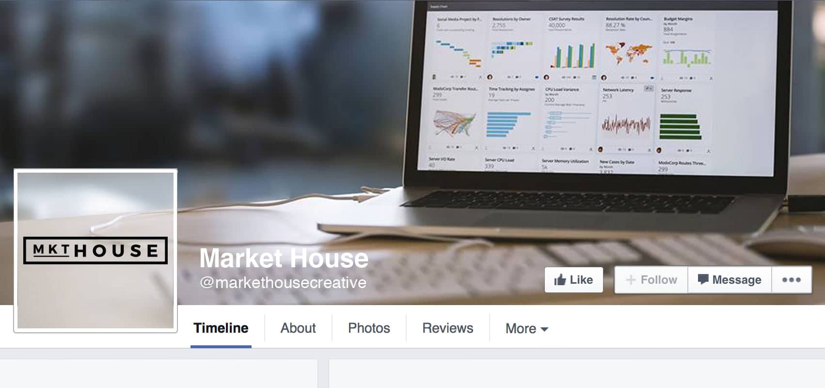
Notice the overlay of the profile picture and the tabs beneath the timeline header. At Market House, our personal touch provided a unique experience to desktop users by creating a seamless header and profile image. Oh well, guess we’ll just have to figure out a new trick!
So what’s changed with Facebook’s new page layout?
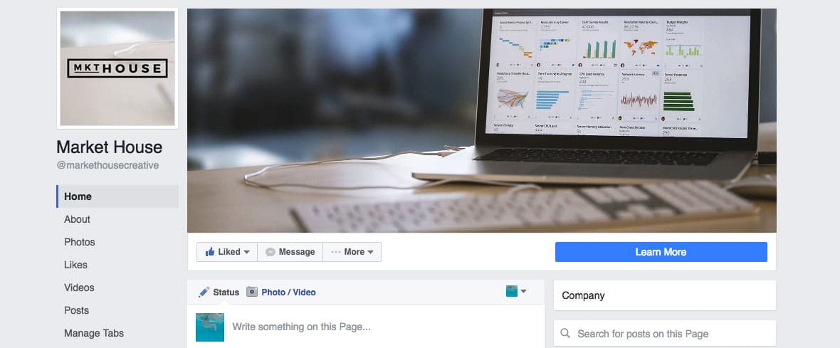
This is the new layout of our Market House Facebook page. Before you continue reading, see if you can spot the differences.
1. New Profile Picture
You’ll notice that the cool overlay effect is no longer applicable and by the time this blog is published, you’ll see an updated profile picture. While the dimensions appear to have remained the same, there’s much more real estate to play with on the timeline header (cover photo).
2. Cover Photo
As I mentioned above, the profile picture no longer hovers above the header, which allows for an uninterrupted view of the cover photo. No text, no buttons, no image overlay. Just a blank canvas. Granted, the challenge of creating a seamless header is gone, but a blank canvas is just as fun to have when designing. The dimensions look to have remained the same here as well.
3. Better Call to Action Button
This is my favorite part of the change. The Call to Action (CTA) button is so much larger and is truly a functional CTA. Before it was somewhat hidden on the cover photo. This feels like Facebook took a tip from their mobile layout by providing a clearer CTA button.
Aside from the new design and layout of the Call to Action button, businesses should begin seeing an uptick in their CTA button traffic. With a larger button & more prominent placement, we can only expect there this to help Facebook business pages.
4. New Tab Layout
As annoying as I’ve found the tabs in the past, I’m happy to see this change here. Facebook’s new page layout has moved the navigation from underneath the cover photo to the left sidebar. This allows for more visible navigation and potentially better traffic to the sub-pages of a business.
The navigation from the previous version was awkward and clunky. This feels like a step in the right direction.
5. Flipped Sidebars
Unlike the layout of your personal Facebook page, Facebook’s new page layout has flipped the location of the sidebar. Secondary content now rides down the right side of the page.
My personal preference in web design is a right-hand sidebar, so this update only feels natural. Besides, the change in the sidebar location balances the new navigation on the upper left.