

7 Tips For Designing A Great Professional Website
Web design might seem intimidating. Perhaps you feel that it’s in the realm of wizardry and computer genius. Maybe you’ve been more focused on getting the content onto the website than how it really looks or acts. The thing is that some simple web design considerations can make a really big difference when it comes to your site – and converting visitors into customers.
With that in mind, we’ve got seven tips for designing a professional website.
- Make the site easy to use.
The design of the website has to promote the purpose of making the site easy to use. If the site is clunky and it’s not intuitive, people will get frustrated. And when people get frustrated, they leave. They’re not going to put up with it, so the site needs to make sense to someone who’s never been there before. (An example would be if you have an e-Commerce store. You’d better make sure that your shopping cart process is simple, quick, and clear.) - Don’t forget site speed.
Your website also needs to be able to load quickly, so your design needs to be pretty streamlined so that the site doesn’t get bogged down. The reality is that people aren’t patient. They want what they want NOW, and that means they won’t sit there tapping their foot and waiting for your site to load. They will bounce and click the “back” arrow. And you don’t want them to click the back arrow and leave. That would be sad.(One way to help site speed is to make sure you don’t have too many images or graphics. These can really slow the site down. Now, that’s not to say that you have to get rid of images entirely. But be intentional and smart about what visuals you are using and save them for maximum impact.) - Use negative space.
You know the white space between different blocks of text or images on a page? Yeah, that’s called negative space. You need to make sure that your site has an appropriate amount of negative space (a.k.a. white space) so that it’s pleasing to look at and not overwhelming. Using white space can help you avoid overcrowding the site and overwhelming people who are looking at it. Plus, you can space out information so that it’s easier for people to read and look at.
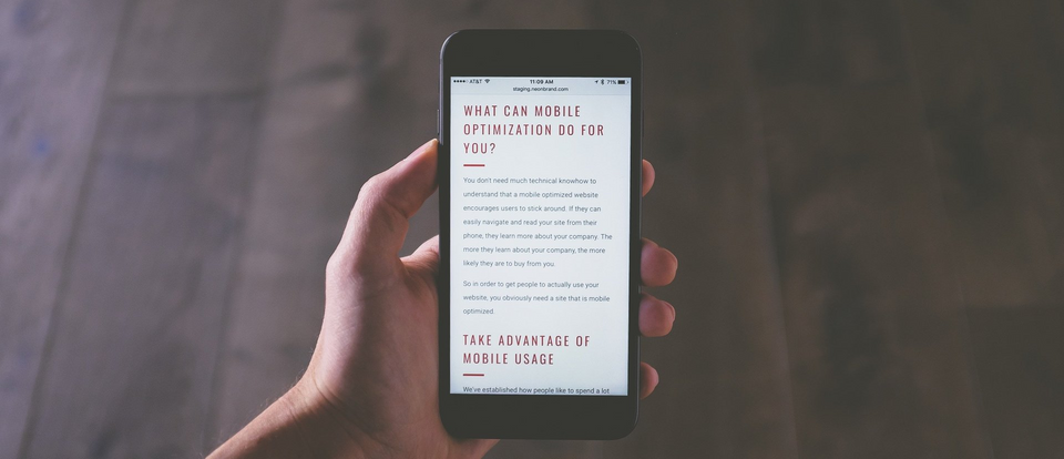
- Remember that mobile is key.
Let’s be real – not many people are browsing the Internet from desktops nowadays. Phones and tablets are taking over the world. So, you need to make sure your website is designed with that in mind. How do you do that? Well, by making sure your site has responsive design. That means that the site is able to adjust to different screen styles and sizes. But in addition to resizing itself to suit the smaller screen, the website still has to be easy for the user to navigate. It still has to make sense. (Remember what we said above – people are not patient.) - Include testimonials.
Your website should also include some customer testimonials or reviews. People like to read what other people say about stuff, and the funny thing is that people trust these reviews. So, consider incorporating a space for some shining customer reviews onto your website. Your potential clients might not want to take your word for how great you are … but they might take the word of another customer! - Have landing pages.
A landing page is basically a web page that’s specifically about one product or offer. Imagine that you’re a potential customer and you click on something you’re interested in … and it takes you to a simple, quick, and easy-to-read page that’s all about what you’re looking for. Perfect! Yeah, so that’s what a landing page is. It provides the need-to-know about the product or offer the potential customer is looking for. But remember that you don’t want to clutter your landing page. It should have a simple, clear call to action and not be overwhelming. - Don’t be afraid to do your own thing.
Sometimes following the latest, greatest trends in web design is helpful, but other times it’s not. For example, stock photos used to be THE thing. Like the be all, end all. But that didn’t mean they were all that great or that they were the best thing for web design. Sometimes you have to be creative and break away from the “trends” that aren’t going to help you in the long run.
—
So, those are a few things to keep in mind when it comes to web design. You want your site to look clean and not too crowded. It should be easy to use and it should be responsive when it comes to mobile. And we get that designing a website might feel like a really overwhelming task, but that’s where Market House can help. We’d be happy to help you get the website you’ve always wanted.
Read More Design & Branding, Website