

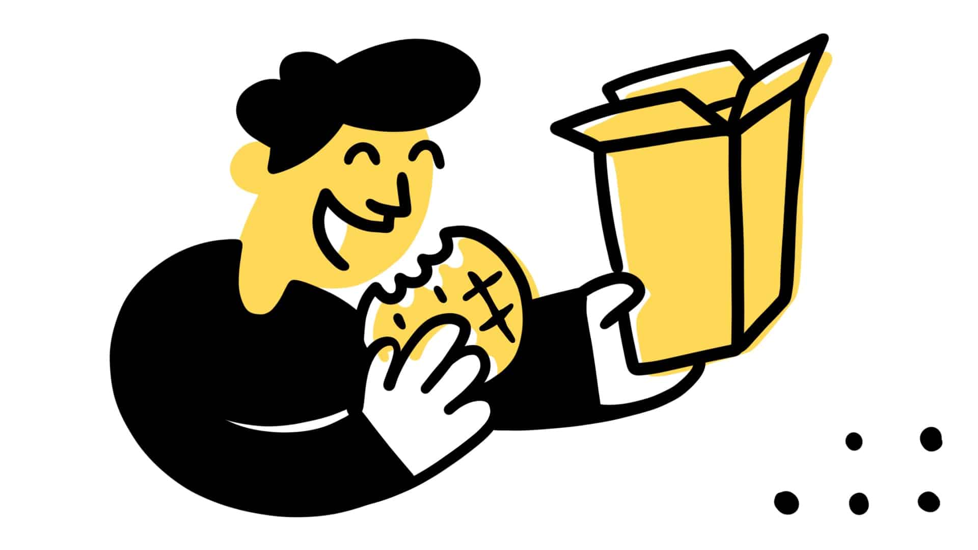
Well hello there, Eggo
When Good Branding Just Feels Right: What We Can Learn from Eggo’s Refresh
You don’t need a degree in design to recognize great branding. You feel it. It pulls you in, makes sense instantly, and speaks to something familiar. Eggo’s latest visual update does exactly that. No theatrics, no trend-chasing. Just smart design that reconnects with the brand’s roots and moves it forward.
Eggo’s redesign says hello to 1979
Some brands assume that “new” has to mean dramatic: a full name change, a new look, a completely different tone. Eggo proves otherwise. With guidance from Design B&B, the breakfast icon sharpened its look without losing the charm that made it so recognizable in the first place.
The refreshed logo is still playful. The yellow feels warmer and in Design B&B’s own words, they “[gave] more energy to Eggo’s classic yellow.” The red script brings back the bounce, which longtime fans associate with lazy Saturday mornings and toaster waffles. It’s more focused, not louder. More intentional, not overdone.
That kind of restraint isn’t easy. It requires knowing exactly what should stay. Eggo’s team understood that consistency matters more than novelty when the product is already a fixture in people’s lives.
A Smart Throwback That Feels Current
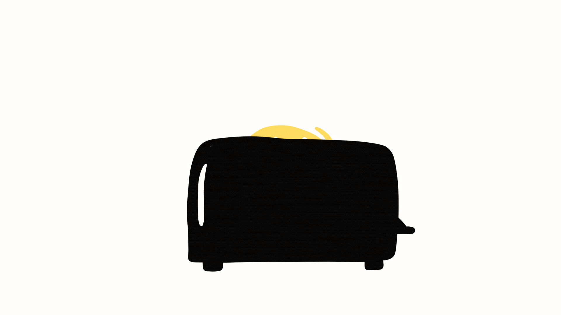
Zack first spotted this change in a post from The Brand Inquirer. And, I am thoathe to admit that even I noted a change in the box of Eggo mini waffles I purchased for my children just last week, it didn’t occur to me that it was entire brand refresh. However, after we did a deep, syrupy dive into the world of Eggo, we noticed that more than just the packaging had changed – it was a full brand refresh.
The new identity pulls inspiration from the brand’s late ’70s to mid-’90s look: an era that defined Eggo for an entire generation. That was the packaging style kids saw in the freezer every morning and the logo parents trusted when grocery shopping.
By revisiting that golden era, Eggo isn’t just appealing to nostalgia. It’s making a calculated move to reestablish trust with millennials who are now in charge of their own grocery carts. This isn’t about looking to retro styles for fun. It’s about anchoring the brand in memories that already carry emotional weight.
Other food brands like Burger King and Pizza Hut have made similar moves, and for good reason. When done with care, a return to the past can feel more forward-thinking than chasing whatever is trending today. And, in Pizza Hut’s case, they made the unique decision to completely adopt their old logo. After all – folks love the classics…
Building Beyond the Logo
Where the rebrand really stands out is in its supporting assets. Many companies stop after the logo, but Eggo leaned into creating a full visual system. These design tools aren’t just nice to have—they are what bring the brand to life in digital, retail, and social spaces.
Highlights include:
-
Friendly, flexible patterns that play well with packaging and social media graphics
-
A custom icon set that adds energy to both kid-friendly and parent-facing touchpoints
-
Round, organic shapes that echo the warmth of the product itself
-
Playful brand characters that add visual storytelling opportunities without needing a full campaign to explain them
These elements create a sense of cohesion without locking the brand into one narrow look. They provide options, personality, and room to evolve. The result is a brand identity that works across platforms while still feeling unmistakably Eggo.
The Takeaway for Brand Builders
Eggo’s refresh is a reminder that the most impactful brand moves don’t always involve radical change. Sometimes the best strategy is clarity. Sometimes it’s refinement. Sometimes it’s simply remembering what made people care about your brand in the first place.
If you’re a business wondering whether it’s time for a rebrand, ask this: do people recognize us? Do they trust us? Are we telling the story we want to tell—or are we trying to match what everyone else is doing?
That difference is where your brand strength either gets sharper or starts to blur.
Want to Get It Right the First Time?
At Market House, we help businesses clarify their brand identity and create design systems that make an impact. Whether you’re launching something new or refreshing what’s already in place, we focus on strategy, storytelling, and creative that actually connects.
If your brand feels like it’s drifting or outdated, you don’t need to start over. You need the right guide.
Just reach out and let’s build something people want to remember.