

What KIND’s Rebrand Teaches Us About Purpose-Led Design
In a Sea of Snack Bars, One Brand Got Louder—Without Getting Lost
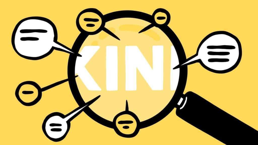
Walk down any grocery store aisle, and you’ll see the problem: dozens of snack bars shouting for attention. High protein. Low sugar. Keto-friendly. Plant-based. It’s loud. It’s crowded. And in that chaos, even great brands get overlooked.
KIND has always stood for something different. Real ingredients. Transparent nutrition. A human-first mission. But with shelves getting noisier and competitors flashier, even KIND needed to rethink how clearly their message was landing.
So, they rebranded—but not by reinventing. They evolved.
And in doing so, they delivered one of the most effective branding updates we’ve seen recently—because they didn’t just get louder. They got clearer.
The Shift: Bigger, Bolder, and More Ingredient-Forward
KIND’s new visual identity centers on one big idea: make the invisible values visible.
Here’s what changed:
- A modernized logo that’s still unmistakably KIND, but now bolder and easier to spot at a distance.
- Enlarged windows on the packaging to showcase the real, whole ingredients.
- Clearer communication of benefits—like protein, fiber, or no added sugar—without clutter.
They’ve also piloted curbside recyclable wrappers and rolled out a new campaign called “All Kinds of Good,” featuring comedians Eric Wareheim and Atsuko Okatsuka. The tone is fun, real, and intentionally a little weird—in a way that makes healthy eating more human.
This wasn’t a pivot. It was a progression.
The Branding Lesson: Design Should Do More Than Look Good
Too often, branding focuses on aesthetics over strategy. But in retail, form has to follow function.
Great packaging doesn’t just look good—it:
- Informs instantly
- Builds trust on a crowded shelf
- Reduces friction for shoppers
- Reinforces your mission without needing a backstory
KIND understood that. Their design didn’t get louder just for the sake of it—it got smarter.
They didn’t try to out-shout the competition. They just made sure you didn’t miss what mattered most.
Purpose Made Practical
KIND’s mission has always been front and center: to create snacks made with integrity and transparency. But in a fast-moving retail environment, noble intentions can get buried under noisy competitors and flashy claims.
This rebrand brought that mission back into the spotlight—without a single value change. Just better storytelling through design.
The tone of their new campaign isn’t self-righteous. It’s relaxed. It says, “We’re healthy. We’re tasty. And we don’t take ourselves too seriously.”
That balance—purpose with playfulness—is where modern branding wins.
The Power of Shelf Clarity
In service-based industries, clarity shows up in your messaging. On the shelf? Clarity is design.
KIND’s update reminds us that:
- You don’t always need a new story—you just need to show your story better.
- Visibility isn’t vanity. It’s accessibility.
- Consistency builds trust—but clarity earns attention.
This is especially important in crowded markets. Your product can be amazing, but if people can’t quickly understand what you offer, you’re leaving opportunity on the table.
Brand Growth Isn’t About Being Louder—It’s About Being Clearer
KIND didn’t rebrand to chase relevance. They rebranded to make their relevance easier to see.
That’s the move.
In a world where attention is fleeting, the brands that win aren’t always the ones with the best stories. They’re the ones that tell their story the clearest, fastest, and most consistently.
Want to Make Your Brand Easier to Understand—Not Just Easier to Like?
At Market House, we help purpose-driven brands evolve visually and verbally—so your audience sees the value you bring in the first few seconds, not just after scrolling your About page.
Let’s talk about turning your clarity into growth.