

What’s A Responsive Website – And Why Does It Matter?
Your business’s website is a key part of your marketing strategy, but nowadays a website doesn’t just live on a desktop computer. People are on the go, using their phones to run searches or grabbing a tablet instead of sitting at a desk. And that means your website needs to be responsive. What’s a responsive website and why does it matter? We’ll explain.
What is a responsive website?
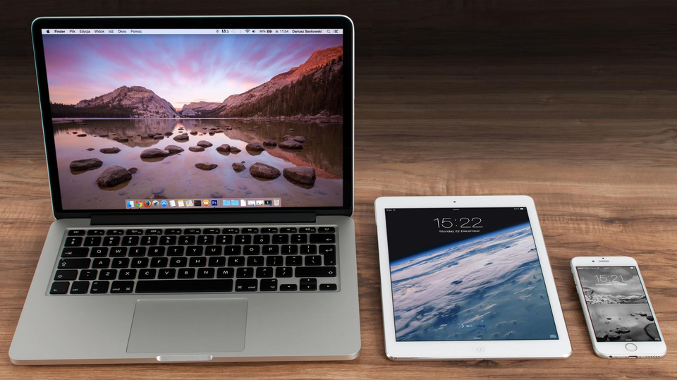
A responsive website is one that can adjust to being viewed on different devices. Whether a potential customer is on their desktop (unlikely), their phone (more likely), or their tablet (also likely), the website will display nicely on whatever electronic gadget they choose. Basically, your website becomes a bit of a chameleon, able to shift and look good on different platforms. Whether someone’s looking at it on a small mobile screen, a slightly larger tablet screen, or a desktop, your website will cheerfully adjust so it looks essentially the same across all three.
(And yes, of course having a mobile-friendly website is important, but a responsive website takes it one step further.)
Pros of having a responsive website.
There are a few very good reasons to make your website responsive. Here are a few.
- Mobile users will appreciate it.
Your goal is to get your website to reach the largest amount of people – and get them to stick around. Since so many people are using their phones or tablets to run searches and do research if your website meets them where they are they’ll be more likely to stay on your page.User experience
User experience is everything, and having a responsive website can help you provide a positive user experience for people who are on phones or tablets. You don’t want your website to be clunky or difficult to use on mobile because that doesn’t give people a positive impression of your business. And, frankly, people often don’t have the patience to wait around for your site to load or to deal with any hijinks because it’s not adapted for mobile.One version of the site does it all
The great thing is that with a responsive website, you may not need to have two separate versions of your website – desktop and mobile. That can be an absolute pain to deal with, and you can spare yourself a lot of grief if your site is simply responsive. Running two versions of your website can be extremely costly, too. A responsive site is both easier to keep up with and less expensive, perhaps, in the long run. - Screen size doesn’t matter.
We talked about this briefly earlier, but it’s worth mentioning again. A responsive website magically fits itself to any screen size. You don’t have to worry about your site looking…interesting…on a phone or tablet because it’s going to take care of that by itself. It’ll look pretty much the same wherever someone looks at it. (It’s a very cool party trick.) With mobile, your site has to be able to adjust to a portrait-style layout, and it has to be able to deal with scrolling. - It can boost your SEO.
Here’s another thing to love about responsive websites: they can help you do better on your SERP rankings. Because people are more likely to hang out on your page if it’s working properly than if it’s not, you could see positive results with your SEO. The name of the game in digital marketing is climbing higher and higher in the search results that Google spits back when someone makes a query for the services your business provides. Having a site with a great user experience can help your case. Remember – you want Google to like you. Having a responsive website can help you make a good impression.
So, that’s what a responsive website is and why responsive website design is important. It means that your site knows what to do when confronted with any screen size, be it a phone or a desktop. It allows you to have one version of your site that’s ready to do it all versus having two separate versions. It can help you with your site maintenance and keep your costs down. And it can even help you with SEO. What’s not to like about responsive websites?
Here at SiteNow, we know you’re looking for a killer website that will reach a wide audience. We want to help you construct the site that you’ve been dreaming of. Responsive design is crucial, and we can help you build a site that will look stellar on any screen.
Read More Design & Branding, Website