6 Best Practices to Generate More Leads On Your Website
I recently stumbled across an incredible website called Internet Live Sites. If you love numbers and data, this site will fascinate you. The site shows the number of active Internet users worldwide, the number of websites, the number of emails sent, the number of Google searches, photos uploaded to Instagram, Tweets sent, and active Facebook users. They even show you how much electricity is being used by the Internet alone. Pretty cool!
While all these numbers are impressive, it also puts into perspective just how big the Internet is. As of writing this blog post, there are currently 1.7 billion websites out there in the world. That’s right BILLION with a “B.”
So how do you stand out in a giant sea of websites? How do you ensure that your website is optimized to generate leads for you?
While there are many different strategies, there are best practices that all websites should implement in order to ensure they are generating leads to fuel the pipeline for their sales team. Here are 6 best practices for you to consider to ensure your website generates the leads you need for your business to grow.

Do you know your audience?
This seems like a no-brainer, but you would be surprised how many businesses have content on their website that doesn’t speak to their audience. So when you sit down to either start putting content together for your website or you are doing an audit of your website content, you should consider five things:
- Who is your primary audience?
- Is there a secondary audience that can influence or inform your primary audience?
- How will they find your site online?
- Is your content speaking to their pain points?
- Are you solving the common problem they need to solve?
So what does this look like?
Say you are a lawyer with your own law firm, your primary audience may be existing clients, but your secondary audience may be other attorneys, others working in law offices, or prospective clients who may need your services in the future. They are more than likely searching online for help with whatever their legal needs may be. What are they searching for? Do you practice in very specific areas?
If so, you want to make sure that can be found on your website easily. More importantly, make sure that those terms are included in the headlines and sub-headers. You want to make sure that you are speaking directly to those pain points and pointing out how you are the solution to all of their legal issues.

Get rid of the jargon
They already know you are the expert. Most of the people online looking for your services may not know the technical mumbo jumbo that you know. You have to make sure your content is not only easy to understand but simple for them to remember. You should consider spelling out acronyms if needed to be used in your content. Don’t assume they know what you mean. By all means, avoid insider language. That’s great that you know what it means, but you aren’t buying your services, they are.
For example, let’s look at this sentence:
The journalist grabbed a SOT from the MOS, drove back to the station, and put the story in the can.
Do you know what a SOT or a MOS is? Did they literally put in a can? It leaves the average reader confused about what you mean and now they need to stop what they are doing and look up what SOT and MOS mean.
What if you said:
The journalist interviewed a bystander about the incident and recorded her statement to include in the story.
Now that is more like it! It is easy to understand to follow, isn’t it? The average reader is going to better understand what you are trying to say when you drop all the jargon and get to plain language. Keep it simple and easy to follow. Your clients will appreciate it and stay on your site longer, which will generate leads.

Make it easy to skim
If you are anything like me, when I see a bunch of text on a website, I tend to mentally check out. Even if I am interested in what the topic is. Something about a lot of text makes me not want to read it. Apparently, I am not alone.
A study conducted by Nielsen Norman Group discovered “that 79 percent of our test users always scanned any new page they came across; only 16 percent read word-by-word.” This is why isn’t important for your content to be scannable.
So, how do you do that? A few things actually. Here are some areas to focus on.
- Use bullet points or numbered lists. Break up that large body of text if you can and put them in an easy-to-digest list. Not only is that easier to read, but it is also easier for people to remember your key points.
- Bring attention to keywords. Make the text bold, highlight, underline, or whatever you want to draw attention to the keywords in your content. Hyperlinking is another good way to draw the idea. Just be careful not to take people away from your site.
- Leave room for white space. By leaving empty space around your text, you are allowing nothing else to compete with the attention of that content. I know what you are thinking, “That’s just wasted space for me to get more content on the page.” However, the extra space makes it more enjoyable to read.
- Use subheadings. Break your content up into sections so as people are scanning, they can find exactly what they are looking for more quicker. Refrain from making the subheaders clever. Instead, think practical here. You want the user to not be frustrated with navigating your content.
- Reduce content more than you think. This last point is key. Shift your mindset from conventional writing and think more about marketing here. You want to say everything as concisely as possible for those people going through your site quickly. Hit the high points. Fill in the gaps once they convert.

Keep them clicking
You want them to know enough information that they are ready to either make a decision to purchase, reach out to talk with someone or click on further information in order to gain more knowledge on what you offer. In turn, it moves them through your sales funnel and generates leads.
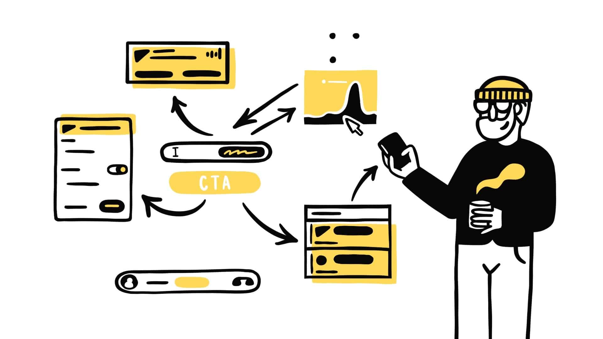
CTAs (call-to-actions) is a great way to cause people to continue digging into your site. The more time someone spends on your website, the higher probability they will convert. You have to define what a win is first. This will help you with what the CTA should be.
There are essentially three types of CTAs to consider on your website to help convert page views to paying customers and fill your sales funnel. Consider these as you think through your CTA’s:
- Informational CTAs – With informational CTAs, you want to offer a piece of content that helps the visitor to get more information on a particular topic. You will need a landing page for this CTA that highlights whatever piece of content you are offering. Examples of informational pieces of content are ebooks and white papers.
- Problem-solving CTAs – With problem-solving CTAs you want to provide content that helps solve a problem the visitor needs solving. Examples of problem-solving pieces of content are testimonials and case studies.
- Giveaway CTAs – With giveaway CTAs, you are wanting to offer a demo or a free trial of your product or service. The goal is to get the visitor hooked on your product so that when the demo or free trial ends, they are ready to purchase. This CTA needs to highlight how you can help them out above all other options that are out there. What makes you different?
Maybe the win is to gather emails or phone numbers so you can reach out to the visitor. Maybe the win is to have them share information that you have or you want them to watch a video for further information. Whatever it may be, you want to keep the CTA simple to follow and have a plan for what you want them to do. If it’s confusing or involves too many steps, most people will give up and leave.
Placement is also important. You want your primary CTA to be “above the fold.” All that means is you want the visitor to see your CTA without having to scroll. That doesn’t mean you want to load the top half of your websites with CTAs. You want to make sure you are spacing them out. Just make sure you have that primary CTA at the top.
Present Your Value Proposition
You know your business’s value proposition. It’s your business for crying out loud. But does your viewer know it? Is it laid out clearly on your site? Visitors should clearly see the value of doing business with you.
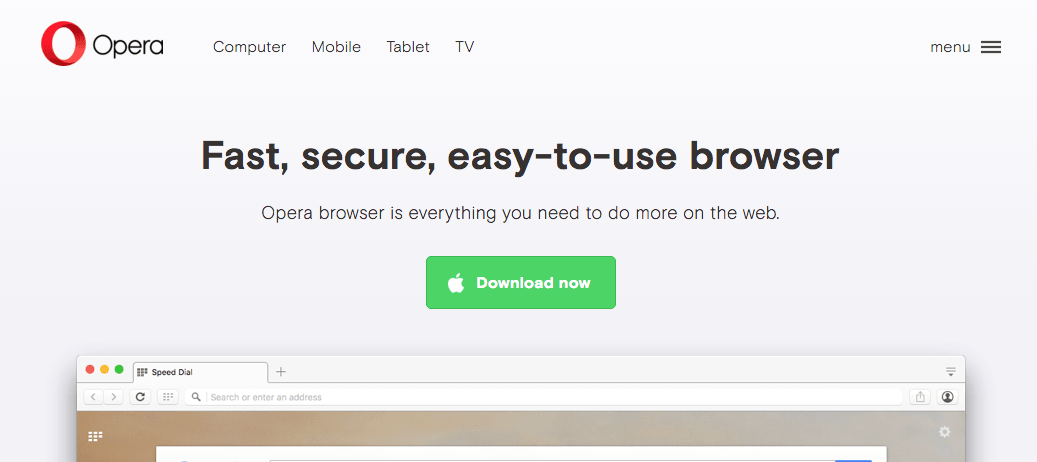
Opera is a great example of presenting their value proposition.

When someone visits their website, it’s clear that they are a web browser. It’s easy to use. It’s fast and secure. Then they have great CTA. It gives them a clear step to download the browser and start using it right away.
Your value proposition should answer these questions:
- What is your company/webpage?
- When I’m using your website, what am I able to do?
- Does your website help solve any of my problems?
- Why should I choose your company/website over any others to solve my problems?

Responsive Design
First off, let’s define the responsive design. Simply put, it’s a website design that adapts to whatever device you are on. Before smartphones and tablets, this wasn’t an issue. No one was viewing websites on anything other than their computer. Now that we essentially have mini-computers in our pockets at all times, websites have to change.
Remember back a few years ago when you viewed websites on your smartphone or tablet and you had to pinch and zoom to view the content? Or scrolling left and right was a common action? Responsive design does away with that. Responsive design is an absolute MUST for your website today.
As previously mentioned, mobile website views have now surpassed desktop views. In order to provide your viewers with the best user experience, a responsive site is a must. In fact, I would recommend that you think about the design of your mobile view first and then your desktop second. Aside from providing a great user experience with responsive design, it also creates fewer pages for Google to crawl which in turn helps with your SEO. Responsive design also helps your website to be ready for future devices that aren’t out yet but will be in the future.
In Conclusion
There are several approaches to help your website generate leads. Whatever you do, you need to have a way to measure the success of your changes. Data and analytics are your best friend in gaining knowledge of what is working and what’s not. Make sure you have those set up correctly in order to make the best decisions and generate the most leads.

