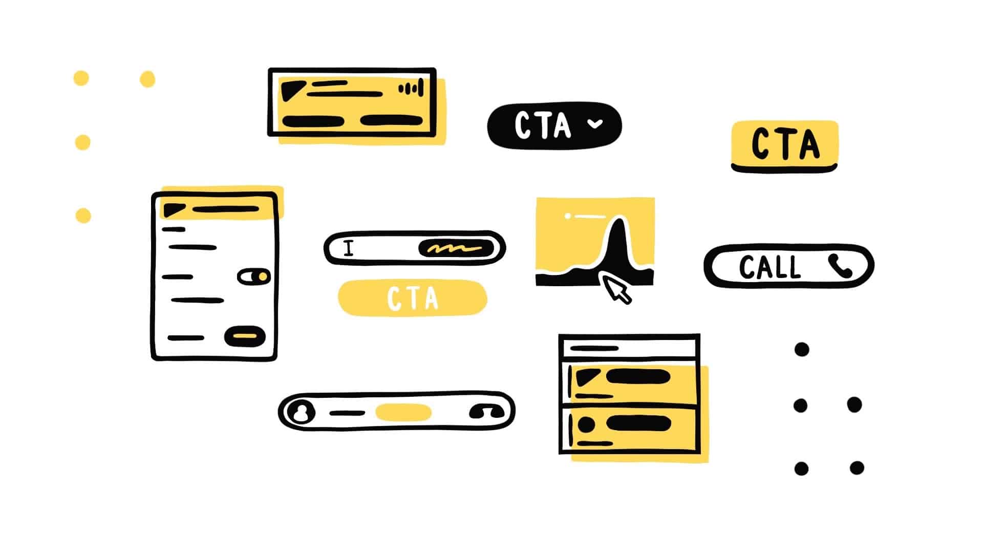
Top 10 Website CTAs (Calls To Actions)
First and foremost, CTA stands for call-to-action. It is an image or text that entices visitors, leads, and customers to take action. While the most commonly seen CTA is “click here” it does not work in all situations nor should it. Every audience/group visiting a site will want to interact with a site in different ways.
No matter how they are interacting with the site, it’s crucial to get visitors to become leads, which will become customers. Ideally, the customers will enjoy the products/services enough to become promoters and free advertisers for the business.
A way to ensure this happens is by tailoring for all of the various types of audiences/groups through the integration of different types of CTAs throughout the site.
Here are our top 10 CTAs:
- Lead Generation
The biggest and most important job of call-to-actions is the task of generating leads. The goal of CTAs is to turn visitors into leads and eventually into customers. CTAs will need to be placed where visitors are most likely to visit. A great place to put a CTA is in the blog section of a website. They can be integrated into the bottom of a post, the sidebar, or a floating banner. - Form Submission
Once a visitor gets to the landing page, they will need to do some interacting with the site before they officially become a lead. They will have to fill out a form with their information to be added to the contact database. This form should be simple, easy to read, and quick to fill out. Rather than having a submit button, make it unique by making it specific to the marketing offer. For example, it could say “Download your guide.” - Lead Magnet
Some visitors will need more of an incentive before filling out the submission form. Their inboxes are constantly over-flooded from sites, so they need to be enticed to make it worth their while. The incentive needs to be specific to the products/services being offered. Instead of a simple newsletter, which most sites have, offer eBooks, spreadsheets, email courses, or checklists in exchange for contact information. - “Read More” Button
An entire blog post will most likely not be able to fit on the home page. Placing the first paragraph or two followed by a click on to “Read More” button can entice readers into becoming leads. This will send them to the blog post allowing the blog to get the stats and views it deserves rather than being included in the same stats as the home page. The “Read More” buttons also allow for more content to be featured on the home page. - Product/Service Discovery
The most important part of a website is making it easy and quick for visitors and leads to find the products/services that are being offered. These CTAs shouldn’t be complex. In order to work efficiently they need to be simple, easy to read, and eye-catching. - Social Sharing
An easy call to action is by adding social media sharing buttons. This encourages a low commitment and minimal brand engagement from visitors, leads, and customers to share with their friends and followers. It can be tempting to place these everywhere, but strategic placement is key. Place them in spots that make sense like in blog posts, ending pages, etc. Do not place them where any personal information is given. - In-line Social Sharing
Instead of having visitors, leads, and customers share the website link, in-line social sharing makes it more specific. If there is a great picture, graphic, or quote from a blog post add a “click to tweet” or “click to share” button. Instead of relying on visitors to the blog to make a great tweet for social media, this makes it quick, easy, and efficient to have an eye-catching promotion. - Lead Nurturing
This type of CTA will be useful when a lead isn’t interested in purchasing the product right away. Converting leads into customers will require lead nurturing by coercing them with a different type of offering, one that is focused on product marketing rather than a regular funnel marketing offer. Examples of this would be offering free trials, quotes, and demos. Place these where leads will visit such as in a blog post. - Closing the Sale
This is the art of taking leads/people visiting the site and converting them from lookers to buyers as soon as possible. These CTAs will mostly be placed on product pages. However, they can be integrated at the end of blog posts. Some potential customers will need to do research before buying a product. - Event Promotion
If there is an event that is being thrown, promotion is key to getting people to attend. An event promotion CTA is one of the easiest to implement because it can be fit into any section of a website. The placement entirely depends on the audience. For example, for customers, the CTA can be placed on a receipt, dashboard, or email. For leads or people just visiting, it can be placed in the blog’s sidebar.
While using all of these CTAs may seem tempting, remember to stay true to the branding of one’s business. Think about the customer and select the ones that work best.

